By Michael Pacitti

What makes a good custom framing designer? You’ve probably heard me mention many times in my Color and Design seminars and workshops: “It might be time to change your job description to custom-framing designer rather than a custom framer.” Generally, custom framers are decorators, and that’s not a bad thing. However, they decorate, but they do not design. The difference, simply put, is that if you’re a custom-framing designer, then you are manufacturing design rather than warehousing it.
Custom-framing design is a process that follows a systematic and coordinated methodology, including research, analysis and integration of knowledge into a creative process to satisfy the needs and resources of your client. Your customers expect you to know what moulding motif or ornament goes with the artwork or image. They also rely on you for matching the right tint, tone and shade of the matboards used. They appreciate your ability to allow more light to travel into an image without glare by recommending a glass that will do it. And they appreciate that you can design a custom frame composition that will last for years because you use higher-quality components and products that are approved.
Build a Custom-Framing Design Platform
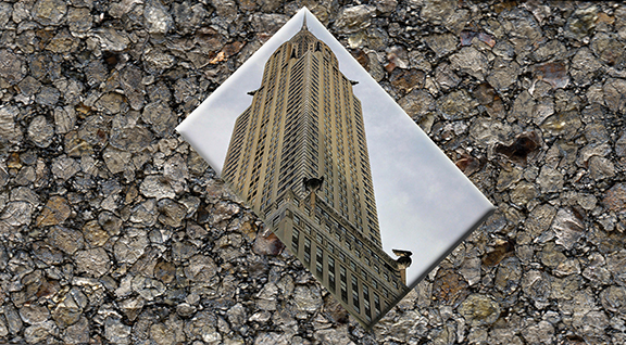
Take, for example, a black and white poster of the Chrysler building in New York. Immediately, the Chrysler building stands out as a true architectural form replicating the Art Deco period. Introducing several variations of Art Deco-styled mouldings, along with matboard colors from the Art Deco period, puts together the final form of the design process. Let the customer know why and how you chose the moulding design and colors to match the image. You are now taking on the role of a consultant rather than a clerk. Customers will appreciate your selection and eventually come back for more design knowledge.
Another good example of Period Design framing is that of Art Nouveau. Art Nouveau images often need an Art Nouveau moulding and Art Nouveau colors. Art Nouveau, entirely different from Art Deco, has movement. Art Deco is regimented, symmetrical, stacked and proportioned. Art Nouveau replicates movement in its truest form. Look for tendrils and flowing designs in the mouldings. Colors of Art Nouveau are muted greens and vegetable tones.
Don’t be afraid to push the boundaries and reach further into today’s mouldings and finishes. They have changed and we have come a long way from plain contemporary mouldings and colors to high-gloss, lacquered, traditional ornamental moulding, which represents a new, transitional look.

Yes, certain consumer generations today want that designer look. They expect you to have the right design for it. We have come a long way as far as design goes in this industry and many of the profiles and finishes are being well received by many consumer groups. No longer is it the big-city look that buys the flashy frames and finishes. When it comes to today’s designs, texture, surface, dimension, brilliance and substance are all around us and now’s the time to embrace them. The longevity of these trends may be short; however, that’s a good thing that will enable more change a lot quicker. It’s called moving forward with the changes.
All of the design tools are there for you, including a new look of texture and surface. Even matboards have taken on a new, fashion-forward look of texture and dimensional surface. Custom framing designers are individuals like you who implement their design skills based on a factory of ideas rather than a warehouse of pre-arranged framing formats. Consider yourself a design factory, not a design warehouse.
Your clients expect you not only to give solutions, but also ideas that will enhance the piece you are working on. Whether it be a war medal in a shadow box or a vintage poster, let the client always know why you are suggesting some form of change or embellishment to the art or object. If you believe that that the green matting needs to be lightened a bit, tell the customer why and how you will do it. For instance, if a matboard on an image is too dark, tell the customer that you believe it will look better if you tint the green board by adding a bit more white to the green.
Adding white to most colors will cause the color to reflect or absorb less or more light. Pushing the green a bit darker will cause a toned effect, so tell the client that you want to tone the green down by adding a bit more gray to the green and choose a more muted green. Finally, if you are looking for a deep, darker green then you will have to shade the green by adding black to it, making it a Hunter Green. These designer buzzwords will carry you further as a consultant to custom-framing design and add more credibility to your work. So, you are not really changing anything here, just adding more design influence.
Customers continually compliment your design skills based on the originality of the design and the final form of putting all the components in place, perfectly balanced. It’s not rocket science; it’s merely your ability to generate ideas using the elements of color and design. Most of your daily tasks already involve these basic elements and principles of color and design. Take color, for instance. You deal with color on a daily basis and you are surrounded with many motifs and ornaments from the hundreds of mouldings on your walls.
So remember when your client drops off an image that needs to be framed by you and you alone, that’s where your design skills kick in. Think about it, you have no pressure, you are in charge and you are at your best comfort level. You may even have a chance to use up some of your obsolete mouldings!
I encourage custom framers to add the word “design” or “designer” to business cards, Facebook pages, websites, etc. Start thinking DESIGN. Tell your customers why you love to design and show them examples. And when you have come to a situation where there is no apparent solution at the beginning of a challenge, that’s where the design process starts with you.


